Day and Night Nautical Charts: Why Map Color Schemes Matter for Safe Boating
What Are Nautical Chart Color Schemes?
Light Color Scheme: Cutting Through Sun Glare
Dark Color Scheme: Protecting Night Vision at the Helm
Quick Comparison: Light vs. Dark Chart Modes
Do Nautical Chart Color Schemes Change Navigational Information?
How to Switch Map Color Schemes in i-Boating
i-Boating Map Color Schemes in Action
Which nautical chart color scheme is best for daytime navigation?
Should I use dark nautical charts at night?
Does switching color schemes change water depths?
Does i-Boating automatically switch between Light and Dark schemes?
Can I use the Dark color scheme during the day?
Does Dark mode save battery power?
Does the Dark color scheme change buoy or hazard meanings?
What Are Nautical Chart Color Schemes?
Nautical chart color schemes determine how navigational information is displayed on electronic marine charts. This includes water, land, depth contours, depth soundings, navigation markers, and other chart symbols.
Unlike ordinary street maps, nautical charts contain information essential for safe navigation, including shallow water, underwater obstructions, channels, and navigation aids.
Digital nautical chart applications can use different color schemes to improve readability under varying lighting conditions.
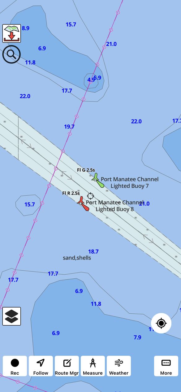
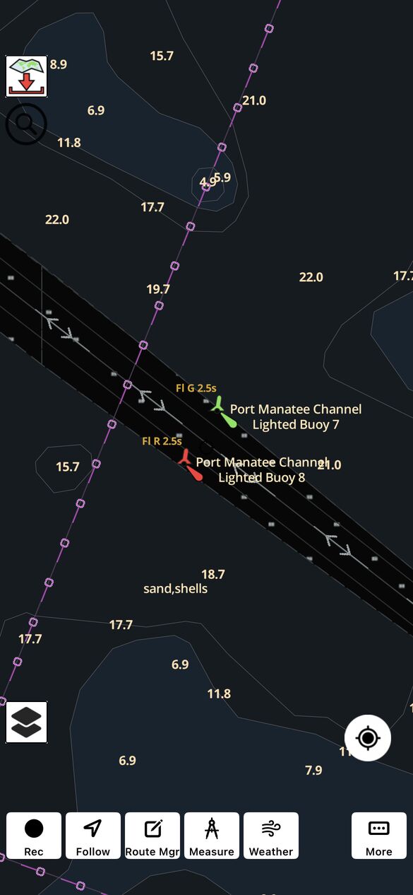
The i-Boating marine navigation app supports two color schemes: Light and Dark. Both display the same underlying navigational information, but use different color palettes and luminance levels to represent chart features.
Light Color Scheme: Cutting Through Sun Glare
The Light color scheme is built for daytime navigation, overcast skies, and open-cockpit helms where ambient light competes directly with your screen.
- High Luminance for Bright Conditions: Direct sunlight and reflections from open water can make electronic chart displays difficult to read. The Light color scheme uses a brighter chart presentation with contrasting colors to help distinguish depth soundings, contour lines, navigation markers, and other important features. For best visibility, boaters should also adjust their device's screen brightness and viewing angle.
- Classic Paper-Chart Familiarity: Traditional cartographic tones—clean whites for navigable deep water, distinct blues for shoals and shallow areas, and warm buff/tan shading for land—allow experienced mariners to interpret bottom topography instinctively.
- Clear Offshore & Nearshore Separation: Whether you are scanning a wide offshore passage or threading a narrow inlet, high-contrast boundaries make underwater drop-offs and shoals stand out immediately.
Best used when: Navigating from sunrise to sunset, fishing in open boats or center consoles, or planning routes in well-lit cabins.
Dark Color Scheme: Protecting Night Vision at the Helm
The Dark color scheme is designed for night watches, pre-dawn departures, and late returns after sunset.
- Preserving Scotopic (Night) Vision: Human eyes take roughly 20 to 30 minutes to fully adapt to darkness as light-sensitive pigment (rhodopsin) builds up in the retina. Glancing at a bright white chartplotter, tablet, or phone screen resets that adaptation in a fraction of a second—leaving you temporarily night-blind to unlit channel markers, crab pot floats, deadheads, or nearby vessels.
- Low-Glare Vector Rendering: Instead of a bright white canvas, the Dark scheme renders deep water in charcoal and black tones while softening land masses and contour lines.
- Preserved Hazard & Buoy Contrast: Critical navigation aids, danger symbols, and depth contours are rendered in calibrated, high-legibility tones that stand out against the dark background without flooding the helm with harsh white light.
Best used when: Running at night, departing before first light, monitoring an anchor watch after dark, or navigating in low-light wheelhouses.
Important: For best results at night, always pair the Dark color scheme with a lower device screen brightness. A dark color scheme alone does not guarantee preservation of night vision if your screen backlight is at maximum output.
Quick Comparison: Light vs. Dark Chart Modes
|
Feature |
Light Color Scheme |
Dark Color Scheme |
|
Primary Environment |
Daylight, direct sun, bright overcast |
Night watches, pre-dawn, dark wheelhouses |
|
Visual Goal |
Overcome sun glare and screen reflection |
Eliminate cabin glare and protect night vision |
|
Water & Land Tones |
White deep water, blue shoals, tan land |
Deep charcoal/black water, muted dark land |
|
Best Paired With |
High device screen brightness |
Low screen brightness (and red-light filter if needed) |
|
Underlying Chart Data |
Unchanged |
Unchanged |
Do Nautical Chart Color Schemes Change Navigational Information?
No. Switching between Light and Dark color schemes changes how nautical chart information is presented, not the underlying chart data.
Water depths, contour locations, shorelines, navigation aids, and other chart features remain geographically unchanged.
The purpose of different color schemes is to improve readability in different lighting conditions while preserving the navigational information available to the boater.
Because nautical chart colors can convey important information about shallow water and navigation hazards, boaters should familiarize themselves with the appearance of these features in both schemes.
How to Switch Map Color Schemes in i-Boating
Because i-Boating renders vector charts dynamically, switching between Light and Dark schemes updates land, depth shading, symbols, and labels cleanly without blurring or pixelation.
- Tap menu/overflow button on the i-Boating map and select Settings.
- Scroll down and select “Light” or "Dark color scheme.
- Tap Save.
Pro Tip for Offshore Night Runs: Even in Dark mode, modern OLED and LCD screens at 100% brightness can still cast noticeable glare in a pitch-black cockpit. Pair i-Boating's Dark color scheme with your device's lowest comfortable brightness setting—or enable your phone/tablet's built-in red color filter for maximum night-vision protection.
i-Boating Map Color Schemes in Action
Here are screenshots showing light and dark color schemes in the i-Boating app.
Frequently Asked Questions
Which nautical chart color scheme is best for daytime navigation?
The Light color scheme is generally preferable during daylight because its brighter presentation can improve chart readability in well-lit environments.
Should I use dark nautical charts at night?
Dark nautical charts are generally preferable at night because they reduce bright screen illumination and may help preserve night vision. Screen brightness should also be adjusted appropriately.
Does switching color schemes change water depths?
No. Switching between Light and Dark changes chart colors but does not modify the underlying water depths, depth contours, or geographic information.
Does i-Boating automatically switch between Light and Dark schemes?
No. i-Boating provides manual selection of Light and Dark nautical chart color schemes, allowing users to choose their preferred appearance.
Can I use the Dark color scheme during the day?
Yes. Either color scheme can be used at any time. The best choice depends on ambient lighting, screen characteristics, and personal preference.
Does Dark mode save battery power?
It depends on the device's display technology. Darker screens may reduce power consumption on OLED displays, while the benefit on traditional LCD displays is generally smaller.
Does the Dark color scheme change buoy or hazard meanings?
No. Switching between Light and Dark color schemes does not change the navigational meaning or geographic position of buoys, hazards, or other chart features. However, their displayed colors and contrast may change to improve readability under different lighting conditions. Boaters should familiarize themselves with how navigation symbols appear in both schemes.